

When Vaadin Ships Your Add-on: What We Did with Toggle Button
In May 2026 we released version 1.0 of Toggle Button, a toggle component for Vaadin Flow. A few months later, Vaadin 25.3 shipped Switch, a core component that does almost the same thing.
If you maintain add-ons, sooner or later this happens to you: the framework catches up and ships something close to what you built. So what now? Do you deprecate your add-on, keep it as it is, or change it? Here we share what we compared, which options we put on the table, what we decided for Toggle Button, and why.
Why we built Toggle Button
When we started Toggle Button, we didn’t know Switch was coming. There were other toggle options around, but we thought ours was worth building for its features and its implementation:
- Labels on both sides of the toggle (“Off” / “On”, “Monthly” / “Yearly”), with an optional
ItemLabelGenerator<Boolean>. - Icons on both sides, placed outside or next to the switch.
- Label highlighting: the label on the active side takes the variant color and the other one is dimmed.
- Color variants (
PRIMARY,SUCCESS,WARNING,ERROR,CONTRAST) and size variants (SMALL,MEDIUM,LARGE). - Touch swipe, plus a
LONGSWIPEvariant with a wider track for mobile. - A fluent API.
ToggleButton toggle = new ToggleButton()
    .setLeftLabel("Dark")
    .setRightLabel("Light")
    .setLeftIcon(new Icon(VaadinIcon.MOON))
    .setRightIcon(new Icon(VaadinIcon.SUN_O))
    .withHighlightLabel();
toggle.addThemeVariants(ToggleButtonVariant.SUCCESS, ToggleButtonVariant.LARGE);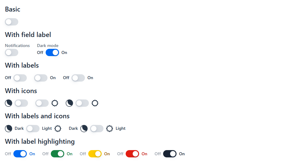
Then Switch arrived
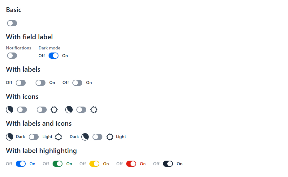
Vaadin 25.3 introduced Switch, an input field “for toggling a single setting on or off”. We compared it with Toggle Button 1.x feature by feature, both against the documentation and against the source code of the web component and the Flow class.
Core Switch (25.3) | ToggleButton 1.x | |
|---|---|---|
| Field label | Yes | Yes |
| Labels on both sides | No | Yes |
| Icons on both sides | No | Yes |
| Active-side label highlighting | No | Yes |
| Color variants | No (CSS custom properties) | 5 variants |
| Size variants | Small (Aura only) | Small, medium, large |
| Touch swipe | No | Yes |
| Keyboard (focus, Space to toggle) | Yes | No |
| Announced as a switch with its state | Yes (role="switch") | No |
| Helper text | Yes | No |
| Required and validation | Yes | No |
| Forced colors (high contrast) | Yes | No |
The comparison was clear on both sides. Core Switch was far ahead on accessibility and form integration. Let’s be honest: Toggle Button 1.x couldn’t be focused or toggled with the keyboard, and screen readers didn’t announce it as a switch or read its state. On the other hand, none of our visual features had a core equivalent.
Deprecate, keep our own, or build on top?
We discussed it as a team in a meeting, with three options on the table:
- Deprecate Toggle Button and point users to Switch. The add-on does things that core doesn’t, like the variants, the side labels and icons, and swipe. Deprecating it would leave those users without an alternative.
- Keep our own web component and add the missing accessibility ourselves:
role="switch",aria-checked,tabindex, keyboard handling, forced colors. That’s possible, but it means maintaining forever something that Vaadin already maintains, and probably maintains better. - Build on top of Switch: let core handle the switch itself and keep only our differentiators on top.
We went with the third option: migrate, don’t deprecate. The goal we wrote down in the issue was a new major version that preserves the API as long as possible, delegates to Switch, and provides any missing feature on top.
With Switch in core, the add-on only makes sense for what core doesn’t offer. That’s where our effort should go.
How do you build on top of a core component?
The meeting settled what to do. How to build on Switch was still open, and we worked it out in the issue by going through the Switch source code: the web component, the Flow class, its Lumo and Aura styles, and Vaadin’s own spec for the component. “Build on top of Switch” can mean several things. We looked at three and chose composition, the only one that held up. We didn’t prototype the other two: reading the source was enough to rule them out.
A. Extend Switch in Java. This was the obvious first idea, but it doesn’t work. vaadin-switch has no default slot, so extra children aren’t rendered, and side labels and icons become impossible. Also, Switch already implements HasThemeVariant<SwitchVariant>, so our class can’t implement HasThemeVariant<ToggleButtonVariant> too. And value change events would become ComponentValueChangeEvent<Switch, Boolean>, a breaking change for any code that uses the event type.
B. Extend the web component in JavaScript and override its template. This means copying an internal template that can change in any minor release. Aura styles target the vaadin-switch tag, so they wouldn’t apply to a custom tag, and the Lumo integration relies on internal API. Too fragile.
C. Composition (our choice). A thin fc-toggle-button wrapper that contains a real vaadin-switch:
[icon] [label] <vaadin-switch> [label] [icon]It only uses public API, and Lumo and Aura apply without changes, so this is the approach we went with. We proposed it in the issue and implemented it in a pull request for the team to review. On the Java side, ToggleButton extends AbstractField<ToggleButton, Boolean> and keeps an inner Switch. Value, read-only, disabled, focus and tooltip are delegated to that inner Switch.
The accessibility wiring is where the core API helps most. Switch lets you reference external elements for its accessible name and description, so the inner switch takes them from the labels and helper text that our wrapper renders:
private void updateAccessibleName() {
    if (!isBlank(ariaLabelledBy)) {
        toggle.setAriaLabel(null);
        toggle.setAriaLabelledBy(ariaLabelledBy);
        return;
    }
    if (!isBlank(ariaLabel)) {
        toggle.setAriaLabelledBy((String) null);
        toggle.setAriaLabel(ariaLabel);
        return;
    }
    toggle.setAriaLabel(null);
    toggle.setAriaLabelledBy(label.isVisible() ? visibleIds(label) : visibleIds(leftLabel, rightLabel));
}
Here toggle is the inner Switch. The accessible name comes from an explicit aria-labelledby, then the ARIA label, then the field label, and finally the side labels. Labels are referenced by id, so they stay in sync when their text changes. The helper text and error message are linked the same way with aria-describedby.
The result: Toggle Button 2.0
Toggle Button 2.0 requires Vaadin 25.3+ and Java 21. Version 1.x stays in maintenance for Vaadin 24 and 25.0–25.2.
What we gained, mostly for free:
- Screen readers announce the toggle as a switch with its on/off state.
- It’s focusable and toggles with the Space key.
- Helper text, required indicator, error messages and
Bindervalidation. - RTL, forced colors and reduced motion.
- It works with both Lumo and Aura.
ToggleButton confirm = new ToggleButton("I confirm the trip details are correct")
    .setLeftLabel("No")
    .setRightLabel("Yes");

binder.forField(confirm)
    .asRequired("You must confirm the trip details to continue")
    .bind(Booking::isConfirmed, Booking::setConfirmed);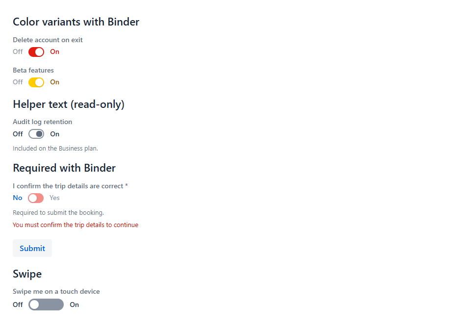
Binder, helper text, required validation and swipe. Try it live.What we kept: the fluent API and the value change event type (ComponentValueChangeEvent<ToggleButton, Boolean>). Composition made this possible: most 1.x code compiles and works unchanged.
What changed:
ToggleButtonno longer implementsHasComponents. Now that the component manages its own children (the inner switch, labels, helper and error message), a publicadd()orremove()would let callers break that structure. Icons are set withsetLeftIconandsetRightIcon.- Without a size variant, the toggle uses the theme’s native switch size. Add
MEDIUMto keep the 1.x look. - The tooltip is attached to the switch, not to the side labels. That way it opens on keyboard focus and screen readers announce it.
- When swiping, the marker no longer follows the finger. The toggle changes state once the swipe passes half the track width. Making the marker follow the finger would mean touching inline styles inside the Switch’s shadow root, which is exactly the kind of fragility we wanted to avoid.
A surprise along the way: since Flow 24.9.2, Binder adds a theme named after the validation level (error, warning…) to any invalid field, and removes it when the field is valid again. Our ERROR and WARNING variants wrote those same names to the theme attribute, so a toggle bound with Binder lost its color as soon as it was validated. In 2.0 the variants write color-error, color-warning, and so on. The Java constants didn’t change, so only custom CSS that targets the attribute is affected.
The full list of breaking changes is in the Migrating from 1.x section of the README.
Switch, Toggle Button or radio group?
Having both components raises a fair question: which one should you use? Vaadin’s own guidance helps here.
- Use core Switch for a single setting that is on or off, like “Notifications” or “Autosave”. If you don’t need anything else, you don’t need an add-on.
- Use Toggle Button when you need what Switch doesn’t offer: labels or icons on both sides, color or size variants, label highlighting, or a wider touch track.
- Use a two-option radio group when both values are equal options rather than “on” and “off”, like “Imperial” and “Metric”. Vaadin recommends this over a switch.
Two-sided labels like “Monthly” / “Yearly” are close to that last case, and they’re still a very common pattern in real applications. If you use them, keep in mind that screen readers only announce “on” or “off”. When the side labels carry meaning, put it in the field label or the ARIA label too. The add-on’s README explains how.
What if Switch keeps growing?
This decision reflects where Switch is today, and Switch will keep evolving. Some of what makes Toggle Button different today could reach core later. Swipe is a good example: Vaadin’s spec leaves drag and swipe out of the first version of Switch (vaadin/web-components#893), but notes it could be added later without breaking changes.
Building on Switch puts us in a good position for that. Every improvement Vaadin makes to Switch reaches Toggle Button without any work on our side. When a feature of ours lands in core, we can drop our version and delegate to it, as we already did with accessibility and validation.
And if one day Switch covers everything Toggle Button offers, deprecating the add-on will be the natural next step, not a loss: it will mean core grew to cover the need.
Takeaways for add-on maintainers
- Core first, add-on when core isn’t enough. A core component should always be the default choice. But when it doesn’t cover everything you need, having an alternative is worth keeping it alive.
- A core equivalent is good news. It means the need was real, and it gives you a solid base you don’t have to maintain.
- Compare against the source, not just the docs. The docs told us what Switch does. The source told us how we could build on it, and why extending it wouldn’t work.
- Delegate the base, keep the difference. We dropped the part core does better (the switch, accessibility, forms) and kept the part only we offer (the visuals).
- Prefer composition over inheritance when building on a core component. It keeps you on public API and protects your users from breaking changes.
- Use a major version and keep the old one alive. Users on older Vaadin versions keep 1.x, and new projects get 2.0.
Try it
Toggle Button 2.0.0 is available in the Vaadin Directory and on Maven Central:
<dependency>
   <groupId>com.flowingcode.vaadin.addons</groupId>
   <artifactId>toggle-button-addon</artifactId>
   <version>2.0.0</version>
</dependency>
Check out the online demo and the source code.
Has something similar happened with one of your components? Did you deprecate it, keep it, or rebuild it? We’d love to hear how you handled it. Let us know in the comments!
Thanks for reading, and let’s keep the code flowing!

Paola De Bartolo
Systems Engineer. Java Developer. Vaadin enthusiast since the moment I heard "you can implement all UI with Java". Proud member of the #FlowingCodeTeam since 2017.
Join the conversation!