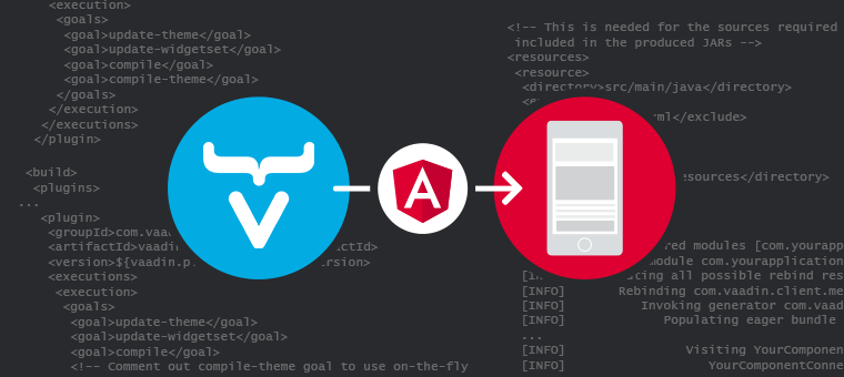
If you’re familiar with our work, you know that we’ve created a few components to be used in Vaadin Flow applications based on existing Web Components or in JavaScript libraries that we found interesting. But what about if you want to use an Angular Component and create a Vaadin component from that? Would that be an easy task? I didn’t have an immediate answer for that question so I did some research, a lot of testing and here are my findings.
Are Angular Components Web Components?
It’s always easier to create a Vaadin Flow compatible component from a Web Component so I asked myself (and I asked Google): Are Angular Components Web Components? The simple answer to this is that they are not but, Angular provides a package to help you exporting Angular Components as Web Components: @angular/elements. As read in the documentation:
“Angular elements are Angular components packaged as Custom Elements (also called Web Components), a web standard for defining new HTML elements in a framework-agnostic way.”
The components of the Angular library that I was interested to use as components in a Vaadin Flow application were not Angular Elements… yet. So, let’s see how to make that happen.
Web Components in the making
This part is not only interesting if you want to use Angular Components in a Vaadin Flow application but also for any application that wants to reuse any existing Angular Component. Once they’re build as Web Components, they can be used in any web application.
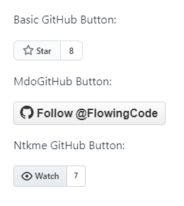
The Angular library that I wanted to use is @ctrl/ngx-github-buttons. It is a simple Angular library containing components to create Github buttons. It gives you the opportunity to choose between three different button styles, as seen in the demo, which translates into three different components (gh-button, mdo-github-button, ntkme-github-button) and those are the ones we want to build as Custom Components.
Before starting the transformation, make sure you have Angular CLI installed (if not just do: npm i -g @angular/cli) and that your Node version is upgraded to the right one.
Let the fun begin
The main idea is to create a separate Angular application where we are going to import the components we want to build as Custom Components. Wrapping them in a new project helps us to create the new Web Components separated from the original Angular project without compromising it’s structure and behavior.
1 – Create a new Angular project
First, we’re going to create a new project from scratch, select the name and run the ng new command like: ng new your-project-name. In my case, it will be ng new @flowingcode/wc-ngx-github-buttons.
2 – Install @angular/elements package
Inside the new project folder, we need to install @angular/elements to turn our components into Web Components. Just run npm install @angular/elements. (About this step, you might find a lot about using ng add @angular/elements but, since Angular’s version 13, this changed as explained here). As a result, if we check the project’s package.json file after install, we will see the new dependency:
"dependencies": {
   ...
   "@angular/elements": "^13.3.8",
   ...
}
3 – Install the Angular library
We need to install the Angular components we are going to convert: npm install --save-exact @ctrl/ngx-github-buttons@7.1.0. Once again, in the package.json file we’ll see:
"dependencies": {
   ...
   "@ctrl/ngx-github-buttons": "7.1.0",
   ...
}
4 – Update outputPath
Go to the angular.json file and update the outputPath attribute to be just dist (you can keep it as it was created but I think that just “dist” is cleaner).
5 – Delete unnecessary files
Delete all files in ./src/app except app.module.ts. Why this? we don’t need to create a new component as we are only going to wrap the ones from our chosen library as Custom Components.
Why keeping the app.module.ts file? Because is the most important file of every Angular application. This file represents the application root module. An application always have a root module, represented by a NgModule class, and it is conventionally named AppModule and resides in the app.module.ts file. This file allow us to import every element we are going to use in the application (like, components, modules and services).
6 – Update app.module.ts
In this step, we need to modify the src/app/app.module.ts file:
- Import createCustomElement from
@angular/elements: this will allow us to transform our angular component into a class that can be passed into the browser’s nativecustomElements.definemethod. - Import Injector from
@angular/core: it will help to inject the component. - As we want to build the three containing components (gh-button, mdo-github-button, ntkme-github-button) we need to remove the bootstrap property and replace it with the entryComponents one, where we are going to list all the components we want to build.
- In the AppModule class, we need to define a constructor and implement the ngDoBootstrap to define the Custom Elements.
The resulting file will look like this:
import { NgModule, Injector } from '@angular/core';
import { BrowserModule } from '@angular/platform-browser';
import { createCustomElement } from '@angular/elements';

import { GhButtonComponent, MdoGithubButtonComponent, NtkmeButtonComponent} from '@ctrl/ngx-github-buttons';

@NgModule({
  declarations: [],
  imports: [
    BrowserModule
  ],
  providers: [],
  entryComponents: [GhButtonComponent, MdoGithubButtonComponent, NtkmeButtonComponent],
  bootstrap: []
})
export class AppModule {

  constructor(private injector: Injector) { }

  ngDoBootstrap() {
    const ngElement = createCustomElement(GhButtonComponent, {
      injector: this.injector
    });
    customElements.define('wc-gh-button', ngElement);
    const mdoNgElement = createCustomElement(MdoGithubButtonComponent, {
      injector: this.injector
    });
    customElements.define('wc-mdo-github-button', mdoNgElement);
    const ntkmeNgElement = createCustomElement(NtkmeButtonComponent, {
      injector: this.injector
    });
    customElements.define('wc-ntkme-github-button', ntkmeNgElement);
  }

}
Remember that there’s a Custom Elements API rule regarding the selectors used in the customElements.define function. They have to consist of two or more words separated by dashes so they can be differentiated from native HTML tags.
Also, even though we’re planing to use the Custom Components outside Angular, we should consider Angular advice and avoid using the @Component selector tag as the custom element tag name as this can lead to unexpected behavior, due to Angular creating two component instances for a single DOM element: one regular Angular component and a second one using the custom element.
7 – Do some testing
You can do a quick test of the components updating src/index.html. There just replace the<app-root></app-root> tag with our newly defined tag names. Then, just run npm start. Just go to localhost:4200 to see it in action.
<!doctype html>
<html lang="en">
<head>
  <meta charset="utf-8">
  <title>@flowingcode/wc-ngx-github-buttons</title>
  <base href="/">
  <meta name="viewport" content="width=device-width, initial-scale=1">
</head>
<body>
  <wc-gh-button size="large" user="FlowingCode" repo="GoogleMapsAddon" count="true"></wc-gh-button></br></br>
  <wc-mdo-github-button type="follow" user="FlowingCode"></wc-mdo-github-button></br></br>
  <wc-ntkme-github-button type="issue" user="FlowingCode" repo="GoogleMapsAddon" count="true"></wc-ntkme-github-button>
</body>
</html>
8 – Build & run
Now it’s time to build the components. Running ng build --configuration production --output-hashing=none will create a dist directory in the project (the name of the outputPath property in the angular.json file) that will contain all the JavaScript files needed to use the newly created web component:
- runtime.js
- polyfills.js
- scripts.js
- main.js
It will also contain a stylesheet file: styles.css. As we haven’t defined any special style for our web components, this file will be empty.
Regarding the JavaScript files, we can merge those into one file, to make it easier to use and import the new custom components. We can achieve this with the help of two packages: concat& fs-extra. Install both dependencies:
npm install --save-dev concat fs-extra
and then, in the root of the project, create a build-components.js file that will take care of generating the merged outcome.
const concat = require('concat');
const fs = require('fs-extra');

(async function build() {
  const files = [
    './dist/runtime.js',
    './dist/polyfills.js',
    './dist/main.js'
  ];

  await fs.ensureDir('elements');
  await concat(files, 'elements/ngxGithubButtons.js');
  await fs.copyFile(
    './dist/styles.css',
    'elements/styles.css'
  );
})();
In addition, we need to add a new rule in the scripts section of the package.json file to specified the elements building:
"build:components": "ng build --configuration production --output-hashing=none && node build-components.js"
Finally, run npm run build:components to generate the elements. The files in elements directory are the ones we need to copy to reuse the Angular Components as Custom Components in any web application.
9 – Final testing
To sum up, we can also add a new index.html file into the elements folder to test and simulate how to use the new generated web components. We need to add the generated JavaScript & style files to the HTML (see lines 10 & 11), something like this:
<!DOCTYPE html>
<html lang="en">
<head>
  <meta charset="UTF-8">
  <meta name="viewport" content="width=device-width, initial-scale=1.0">
  <meta http-equiv="X-UA-Compatible" content="ie=edge">
  <title>Testing Github Buttons Web Component</title>
</head>

<link rel="stylesheet" href="styles.css"/>
<script type="text/javascript" src="ngxGithubButtons.js"></script>

<body>
  <wc-gh-button size="large" user="FlowingCode" repo="GoogleMapsAddon" count="true"></wc-gh-button></br></br>
  <wc-mdo-github-button size="large" type="follow" user="FlowingCode"></wc-mdo-github-button>
</body>
</html>
To see this working, just install http-server and run it from the elements directory:
npm install --save-dev http-servernpx http-server elements
Then, in your browser, go to http://localhost:8080/elements/index.html to see the example page displayed, which means we succeded in creating the Custom Components.
An interesting observation
By this point, the ones that are pretty familiar with Custom Components already inspected the resulting DOM and are wondering “Where is my Shadow Root?”. Well… Angular doesn’t use native Shadow DOM by default, it uses an emulation. This can be changed by defining an encapsulation property. But, if no encapsulation property is provided, it will use Emulated by default and, as a result, it will not create a Shadow Root for the components. To change to native Shadow DOM, just add an encapsulation property with its value set to ViewEncapsulation.ShadowDom.
The components in @ctrl/ngx-github-buttons don’t have any encapsualtion property set, so they don’t have a Shadow Root and that makes our resulting Custom Components to don’t have one either.
If you’re interested you can find more about how view encapsulation works on Angular here.
To publish or not to publish
To make it available for public use, you can publish your newly created Custom Elements to NPM. Of course this depends on your license limits and the purpose of the creation of the Web Components.
If you chose to publish, you should follow these steps:
- Make sure you have an npm account (very important step!!)
- Go to the root folder of the project and run
npm login - Give the needed credentials
- Run
npm publish --access public
Find all the code for the Web Components project in this GitHub repo.
How to use the new components in Vaadin
For this part, I’ve created a simple Vaadin project with the latest released version (to do this you can use the Vaadin starter or create a project through the mvn archetype:generate command).
According to Vaadin’s documentation, to use a Web Component in Vaadin, you need:
- to load the HTML/JS/CSS files needed by the component;
- a Java API to configure the component and listen to events from it.
As we discussed before, here we can be in the presence of two different scenarios, we’ve already published the package containing the new Web Components in npmjs.com or we chose to just keep them locally.
Local Web Components
1 – Create new frontend folder
Firstly, I added a new folder in the src\main\resources\META-INF\resources\frontend\ directory, called githubbuttons. In this new folder, I pasted the two files that we generated for the Web Components (see elements directory in the Angular project):
- JS file: src\main\resources\META-INF\resources\frontend\ githubbuttons\ngxGithubButtons.js
- CSS file: src\main\resources\META-INF\resources\frontend\ githubbuttons\styles.css (we can ignore adding this file as it is empty in our example).
2 – Add needed annotations
Having those resources in the frontend folder, we can import them using the following annotations:
- @JsModule for the js file. This annotation should be use to define the JavaScript Module dependencies of a component.
- @CssImport for the styles file. This annotation should be use to define CSS files that would be imported into the application bundle.
Also, need to use the @Tag annotation that defines the name of the HTML elements (the ones we added in the AppModule class when defining the Custom Elements by calling customElements.define).
3 – Create the API
In order to know how to create a proper Java API we need to take a look at the API defined by the original component. There we can find what properties and events can be invoked. Then, for example, we can create an API for one of the buttons components (wc-mdo-github-button) like:
import com.vaadin.flow.component.Component;
import com.vaadin.flow.component.Tag;
import com.vaadin.flow.component.dependency.CssImport;
import com.vaadin.flow.component.dependency.JsModule;

@Tag("wc-mdo-github-button")
@JsModule("./githubbuttons/ngxGithubButtons.js")
@CssImport("./githubbuttons/styles.css")
public class MdoGithubButton extends Component {

    public MdoGithubButton(String repo, String user) {
        this.setRepo(repo);
        this.setUser(user);
    }

    /**
     * Sets the button's type. Type can be 'star, follow, watch, fork'.
     * Default value 'star'.
     *
     * @param type the type of the button
     */
    public void setType(String type) {
        this.getElement().setProperty("type", type);
    }

    /**
     * @return String return the type
     */
    public String getType() {
        return this.getElement().getProperty("type", "star");
    }

    /**
     * Sets the repository name.
     *
     * @param repo the repository name
     */
    public void setRepo(String repo) {
        this.getElement().setProperty("repo", repo);
    }

    /**
     * @return String return the repo
     */
    public String getRepo() {
        return this.getElement().getProperty("repo");
    }

    /**
     * Sets the user or organization name.
     *
     * @param user the user or org name
     */
    public void setUser(String user) {
        this.getElement().setProperty("user", user);
    }

    /**
     * @return String return the user
     */
    public String getUser() {
        return this.getElement().getProperty("user");
    }

    /**
     * Sets whether to show count or not.
     *
     * @param count if true, it shows count.
     */
    public void setCount(boolean count){
        this.getElement().setProperty("count", count);
    }

    /**
     * @return boolean return the count
     */
    public boolean isCount() {
        return this.getElement().getProperty("count", false);
    }

    /**
     * Sets size of the button. Use 'large' for a bigger size button.
     * Default value 'none'.
     *
     * @param size the size of the button
     */
    public void setSize(String size) {
        this.getElement().setProperty("size", size);
    }

    /**
     * @return String return the size
     */
    public String getSize() {
        return this.getElement().getProperty("size", "none");
    }

    /**
     * Specifies where to open the github link. Default '_self'.
     *
     * @param target where to open the link
     */
    public void setTarget(String target) {
        this.getElement().setProperty("target", target);
    }

    /**
     * @return String return the target
     */
    public String getTarget() {
        return this.getElement().getProperty("target", "_self");
    }

}
And then we can use it like:
public class MainView extends VerticalLayout {
    public MainView() {
        MdoGithubButton ghbFollow = new MdoGithubButton("GoogleMapsAddon", "FlowingCode");
        ghbFollow.setType("follow");
        ghbFollow.setSize("large");
        add(mdoGhbStar);
    }
}
Published Web Components
The important part here is that the Web Components package is already publicly available through NPM so the only thing to do is to add the right annotations (we don’t need to copy any file like before, because the components are already published). Therefore, to create a Vaadin component, we just need to use the @NpmPackage annotation to tell the application to import that Web Component. Also, we need to use the @JsModule, @CssImport and @Tag annotations. So, if we go back to the previous example, the header will look like this:
@Tag("wc-mdo-github-button")
@NpmPackage(value = "@flowingcode/wc-ngx-github-buttons", version = "1.0.0")
@JsModule("@flowingcode/wc-ngx-github-buttons/elements/ngxGithubButtons.js")
public class MdoGithubButton extends Component {
...
}
And just like that, we’re using an Angular originated Web Component in a Vaadin application.
My happy ending
To give a proper end to my investigation, I used the generated Web Components to create a Vaadin wrapper component or Add-on. For that I previously published @flowingcode/wc-ngx-github-buttons in NPM to make it public.
I added a most complete API to represent the three different types of GitHub buttons and published the new add-on in Vaadin’s Directory so anyone can use it. As a result, GitHub Buttons can be easily defined like:
// Basic GitHub Button
GitHubButton githubButton = new GitHubButton("GoogleMapsAddon", "FlowingCode");
githubButton.setCount(true);
githubButton.setTarget("_blank");

// Mdo GitHub Button
MdoGitHubButton mdoGithubButton = new MdoGitHubButton("GoogleMapsAddon", "FlowingCode");
mdoGithubButton.setType(MdoGitHubButtonType.FOLLOW);
mdoGithubButton.setSize(ButtonSize.LARGE);

// Ntkme GitHub Button
NtkmeGitHubButton ntkmeGithubButton = new NtkmeGitHubButton("GoogleMapsAddon", "FlowingCode");
ntkmeGithubButton.setType(NtkmeGitHubButtonType.WATCH);
ntkmeGithubButton.setCount(true);
ntkmeGithubButton.setSize(ButtonSize.LARGE);
ntkmeGithubButton.setTarget("_blank");
And they will look like this:
Find the complete source code for this GitHub Buttons Add-on here.
Conclusion
It turned out to be a very long investigation but at the end I think the steps are clear and easy to follow. The possibility to reuse, in a different framework, a component that was born as an Angular Component just by making it a Web Component is, in my opinion, a very powerful one.
Before I say goodbye, I would like to point out two really important things:
- These are my very first steps in the Angular world so my deepest apologies if I said something wrong about it.
- The Angular library I chose it’s simple and maybe some other adjustments are required for more complex ones.
Hope someone would find this useful and please, feel free to write if you have any doubt, comment or question.
Thanks for reading and keep the code flowing!


Join the conversation!